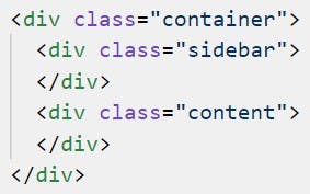
It's a classic scenario. You have a sidebar, and you have content. They are getting in the way of each other, and float: left isn't going to cut it.
Flexbox was made for this kind of thing!
To begin, find the common element that contains both your sidebar and your content. Give it the following styling so that the elements within can make use of Flexbox rules.
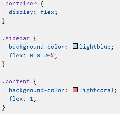
display: flex;
As a general rule, when it comes to Flexbox, parent elements do not own the styles of their children. Elements tend to own their own styles.
Step 1 - Fix your sidebar!
Make sure you are applying this style to an element directly below the one with display: flex on it.
This is a use case for flex-basis.
flex-basis is a little hard to describe without introducing its siblings: flex-grow and flex-shrink. flex-basis is the width (or height for column scenarios) that an element will take before it makes the decision to grow or shrink. It is the basis for flex behaviour.
flex-grow and flex-shrink define how the element may change in size relative to the basis it has. In this case, we can guess what we want for these values. Zero! We want the sidebar to be a particular size and to not grow or shrink. What this means is that we can ignore these attributes entirely; they will default to 0 if not specified.
In the end, all we need to do is give our css this line:
flex-basis: 20%;
(The 20% can be 200px, 20vw, whatever you want it to be).
You can also make use of the flex attribute, defining it like so:
flex: 0 0 20%;
This is shorthand, defining respectively flex-grow, flex-shrink and flex-basis. Using flex: 20% will also set your flex-basis to 20%. However, it will default your flex-grow and flex-shrink to values of 1, resulting in automatic shrinking or growing depending on the circumstances.
By the way, if you say flex-basis: auto it means that flex-basis should refer to the element's width or height property, whichever is relevant.
Part 2 - Stretch your content!
Now, here is a use case for flex-grow, or flex, depending on your preference.
In this case, you don't care how big or small your content is. Given the fixed size of your sidebar, you simply know that you want your content to take up all remaining space in the container. This means you don't need to specify a flex-basis at all. To explain this, I will need to explain how flex-grow works.
The value you give to flex-grow is used as a proportion. All elements under the display: flex container have to share the space that it contains. Each element will take up its flex-basis and then will use flex-grow to divide up what is left and decide who is really the favourite child.
If you have multiple elements all with flex-grow: 1, then they will evenly distribute what is left. If you have three elements, two with flex-grow: 1 and one with flex-grow: 2 then you will find the first two taking quarters and the last taking a half. Basically an element with a flex-grow value will take up its own value as a proportion of the sum of all flex-grow values within the same flex container.
In this case, the sidebar has a flex-grow value of 0. This means it gets no cut of the space remaining after flex-basis has had its way. The result is that if we give the content element a flex-grow value of 1, we are telling it that it can take up 100% of the remaining space. This is because it has no competition.
flex-grow: 1;
However, specifying it this way is considered somewhat bad practice. It is preferable to use the flex attribute if possible. Instead we can write:
flex: 1;
Which is equivalent to:
flex: 1 1 0%;
As previously stated, this means flex-grow and flex-shrink are both 1, and flex-basis is 0% (as we wanted). But what's with this flex-shrink: 1 business?
In the same way that flex-grow allowed the content element to take up remaining space after flex-basis has its way, what if there isn't enough room in the element to contain the sum of all flex-basis values? Then something will have to shrink, and flex-shrink will decide the proportion at which elements reduce their size. This isn't necessarily needed here, but for more advanced sidebars, you could easily envision a scenario where flex-shrink could come in handy.
Demonstration


Sorry about these screenshots lol. Anyway, happy coding!
